Now compare it to this population concentration map based on the 1972 census, which is clearly outdated, but gives an idea of the ratio between floods and displacement:
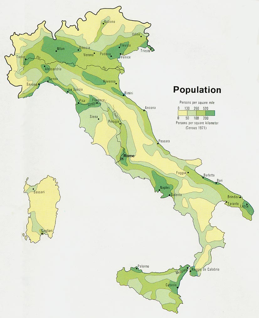
As you can see, not only Venice, but also all the Venetian inland would be flooded, including Padua, Vicenza, Rovigo and possibly the southern edges of Treviso. All the coastline of Romagna, including the ancient capital of the Western Roman Empire, Ravenna, together with Rimini and all the tourist resorts of the Adriatic coast. Incidentally, this is the area that hosts the highest concentration of Italian SMEs, and is considered Italy's economic heart. Oh, and say bye bye to the leaning tower of Pisa too...


2 comments:
Love your tid bits of wealth. For me this blog is the lazy man's guide to Eco studies. Keep on keeping informing me.
I'm off to buy a rubber boat for my Vicentini friends.
He he he... Lovely seeing you on Sunday. Come back soon to visit us (but consider coming by train next time...!)
Post a Comment